




Thank you! Your submission has been received!
Oops! Something went wrong while submitting the form.
Brand Identity System
An emblem, a voice system and a full identity for a publishing imprint rooted in Sankofa and riddim.
Scope of Work
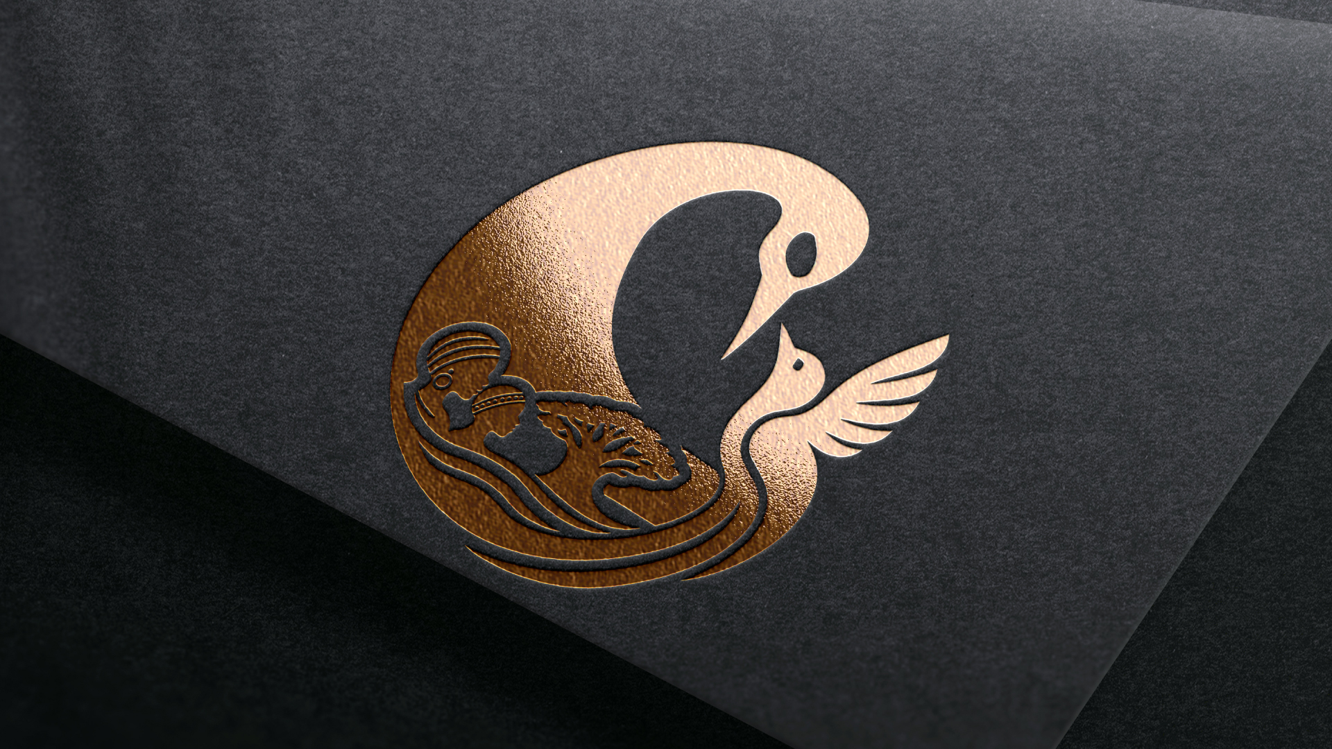
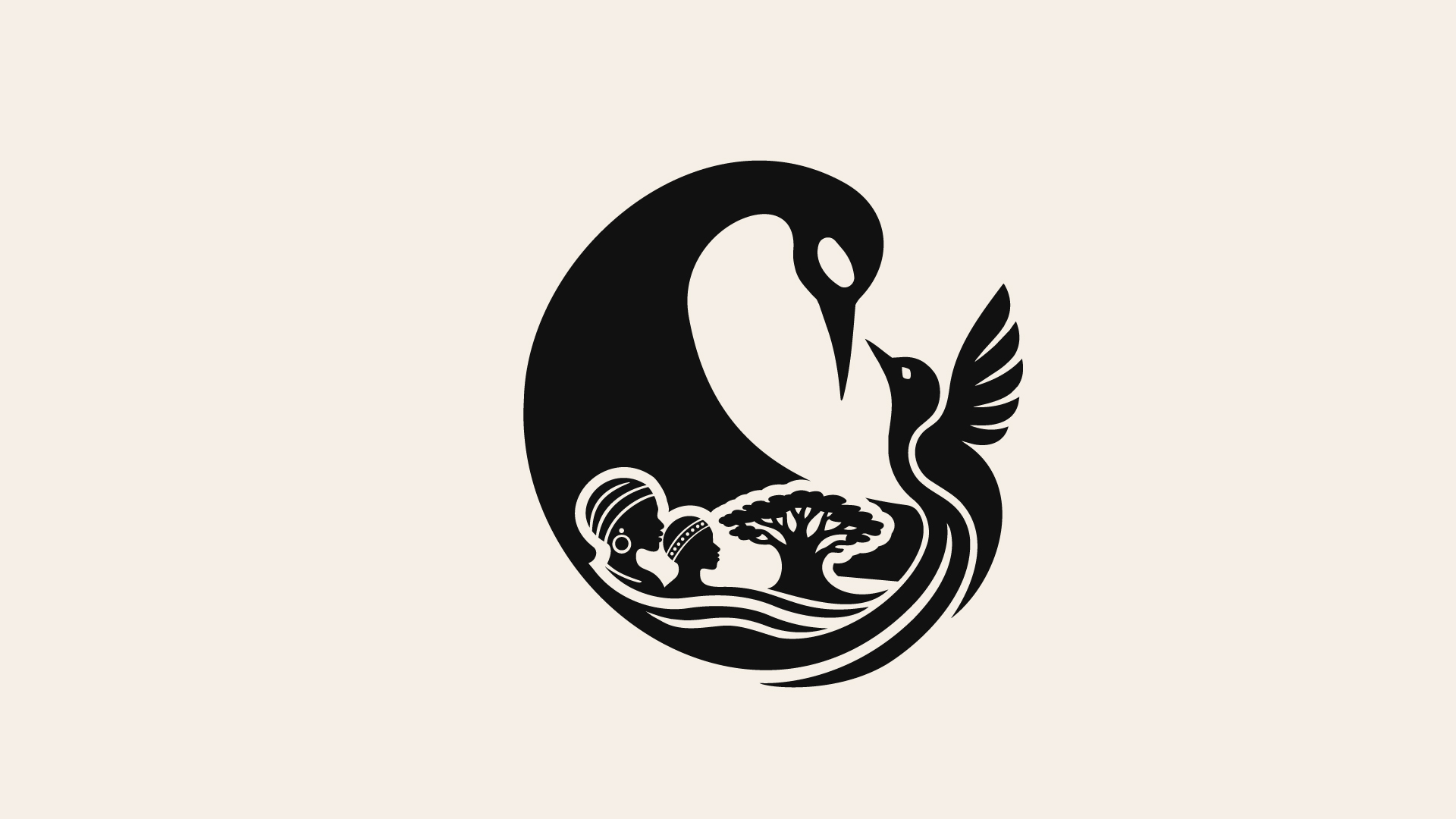
One continuous line forming an S, the Sankofa bird and the Doctor Bird.
01
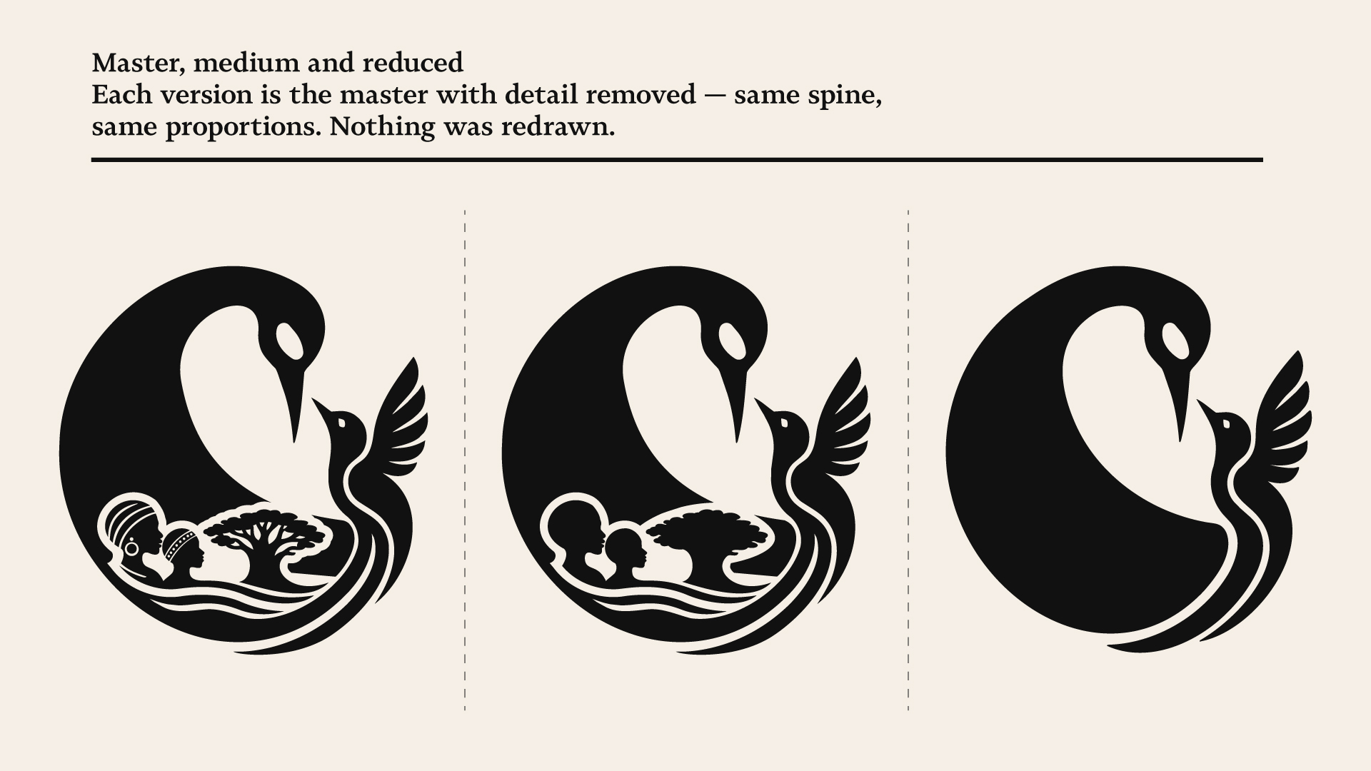
Master, medium and reduced, built by removal so all three share one spine.
02
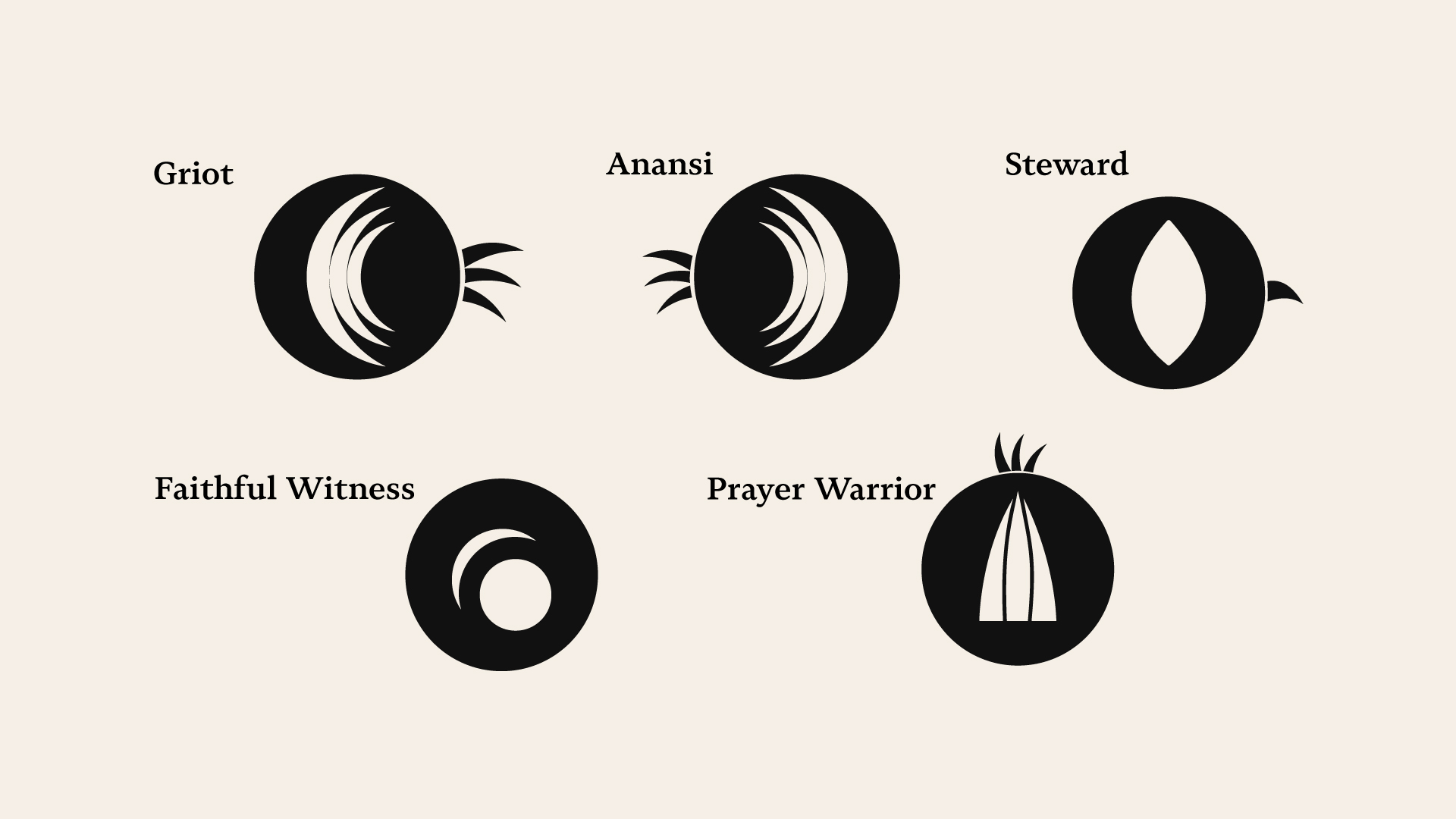
Five marks for the recurring voices in the publication.
03
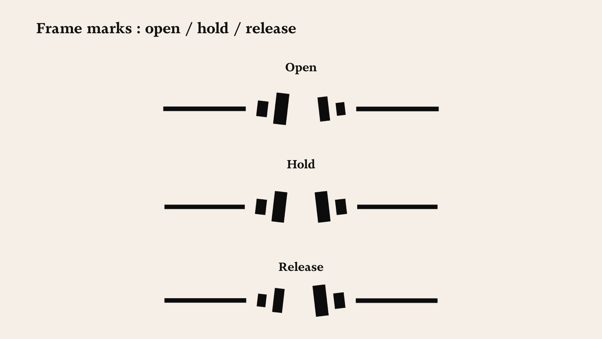
Open, hold and release, marking the rhythm of each piece.
04
A weighted palette and Novela across a seven-level editorial hierarchy.
05
A system the client’s team can run without the designer.
06

Sankofa Riddim™ is a publishing imprint founded on the Akan principle of Sankofa and the Jamaican tradition of riddim. The founder came with the story worked out and asked for a mark that could be owned and filed. Two routes, both drawn from scratch: sketched by hand first, then built as vector. Nothing traced or adapted
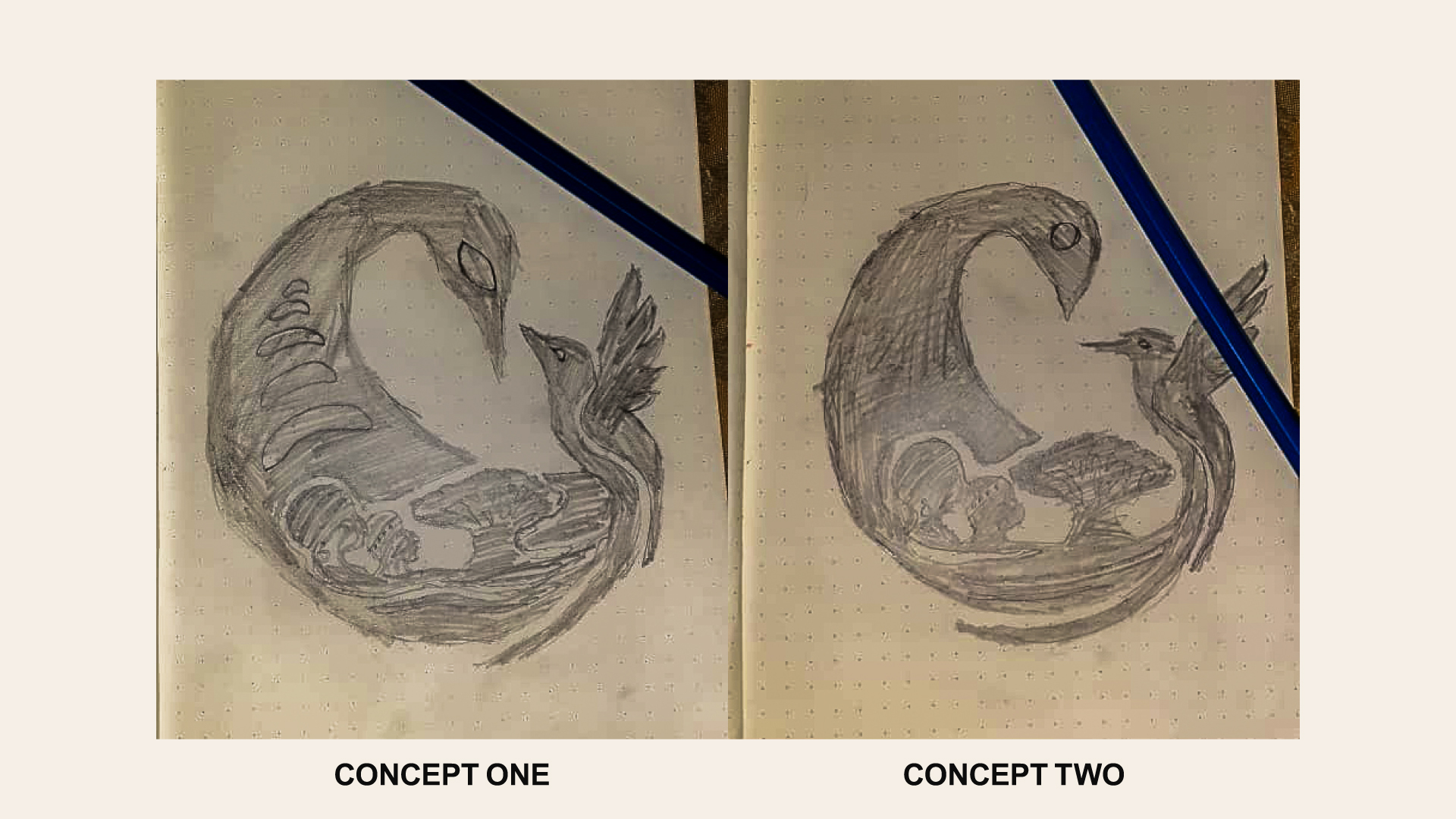
The Sankofa bird’s neck turns back on itself, sweeps through the body, and releases at the base into the Doctor Bird: one continuous line forming an S. The initial of the name, and the gesture of looking back. The two heads face opposite ways: one remembers, one moves forward.
The two heads oppose each other: a conversation between remembrance and progress, visible at a glance.
The Sankofa bird:memory, wisdom, stewardship
The Doctor Bird:resilience, joy, forward movement
The circle:continuity, generations, the unbroken line
The figures:ancestors, community, the foundation beneath
The baobab:roots, provision, endurance across generations
The water:the crossing, the journey, renewal
Read from the base upward: water carried the people, the people planted the tree, the tree grew inside the memory, and the memory turned to face forward.
Why fewer elements
The brief listed more symbols than the seal carries. The ones that remain hold the founding claim and survive at every size: in foil, in one colour, at favicon and wax-seal size. Three elements read everywhere; seven read nowhere small.
The elephant, the lion and the mountains belong in the wider system, in illustration, chapter openers and patterns, where there is room to draw them properly. The seal stays singular.
Three tiers, built by removal rather than redrawn. The reduced version is the master with detail stripped away, so all three keep the same spine and proportions. Most reduced marks are drawn separately and quietly drift from the original. This one can’t.
The publication isn’t written like an essay. It’s written like something spoken: one line to a paragraph, and recurring sections that return under their own names: the Griot, Anansi, the Steward, the Closing Rhythm. The page didn’t know that.
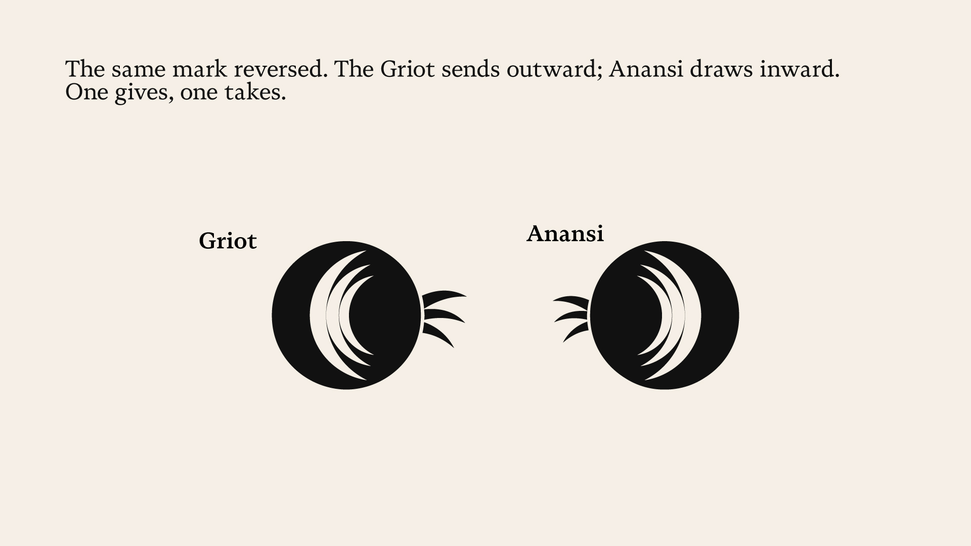
The Griot and Anansi are the same mark reversed. The Griot sends outward; Anansi draws inward. One gives, one takes.
The Steward speaks plainly: a single form and one stroke leaving it. The Faithful Witness watches rather than speaks: nothing leaves the circle. The Prayer Warrior speaks upward: the strokes leave through the top, not the side.
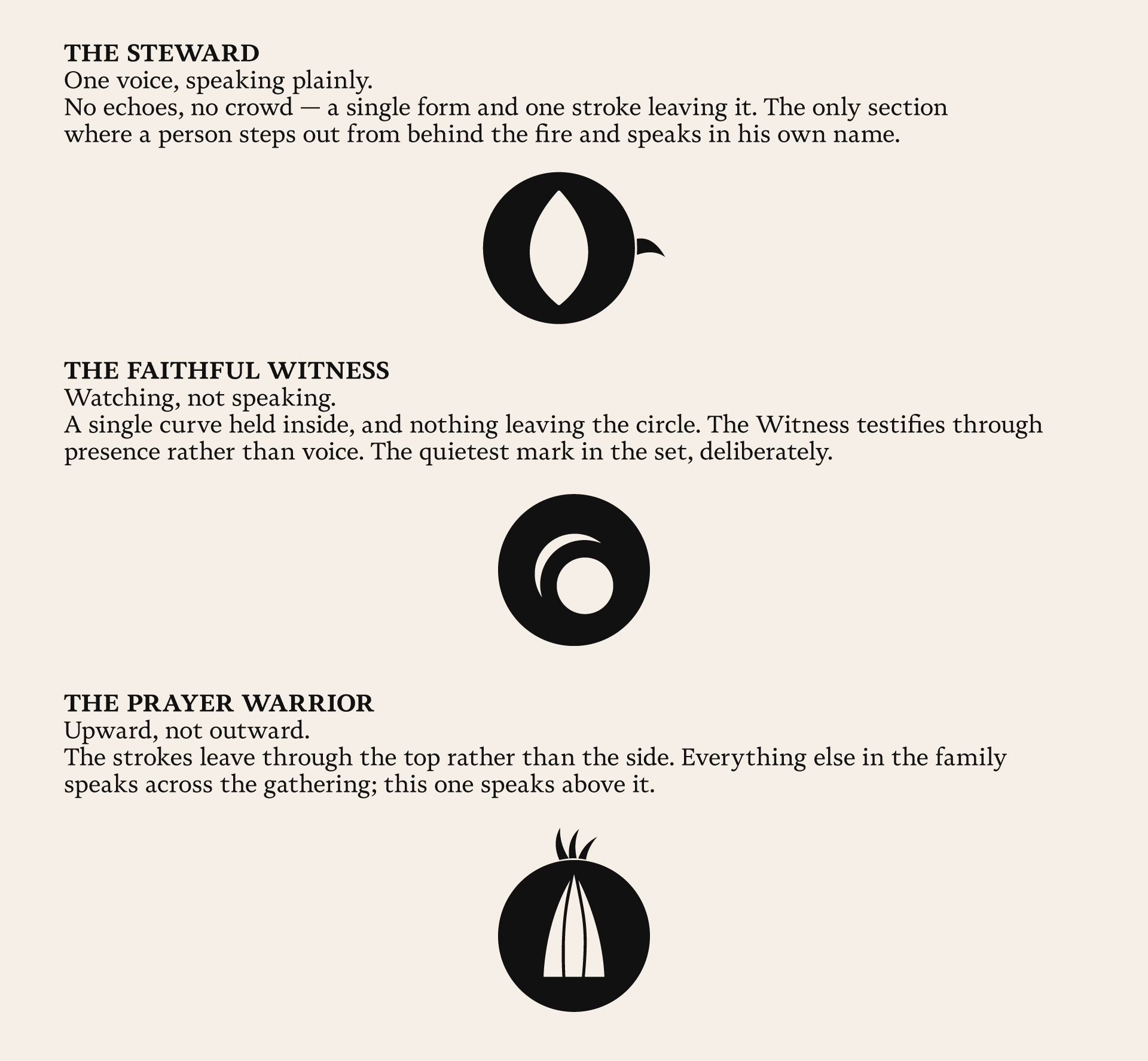
Same circle, same weight, same stroke language. What changes is the arrangement: what is held inside, what leaves, and in which direction. A voice that transmits sends strokes outward. A voice that takes turns them inward. A voice that only observes sends none.
The system is a grammar, not a set.
❝ Not a collection of icons, but a grammar capable of holding meanings we hadn’t anticipated when we began. ❞
Ray Dockery, Founder, Sankofa Riddim™
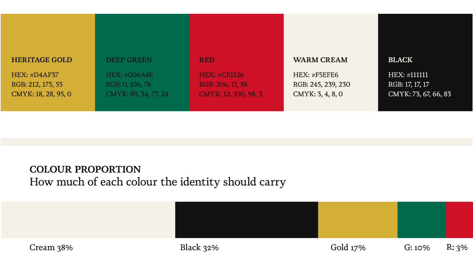
Used in equal measure, the palette reads as pattern. Weighted this way, it reads as an imprint.